GiNi.Tech
Brochures
Brochures
Couldn't load pickup availability
Maximize High-Quality, Organized Brochure Printing
Brochure printing is part of every successful marketing campaign. Give away brochures at conventions, highlight details about your new collection, or include them with every new customer purchase. They are an effective, versatile, and affordable promotional tool.
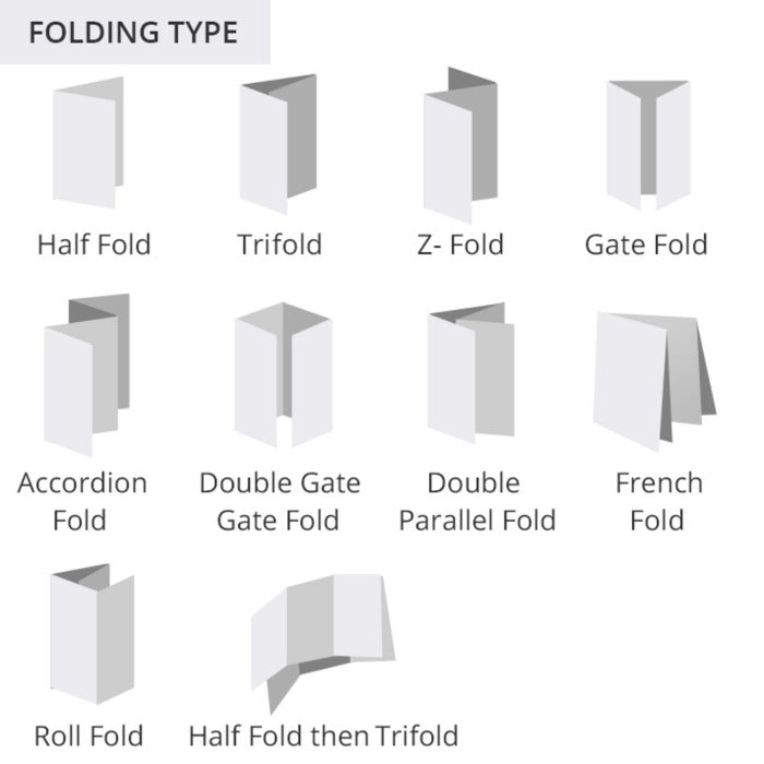
It would help if you had a fold that complements your brand and brochure design. Please choose from our nine available brochure folding formats.
2-Panel Folds
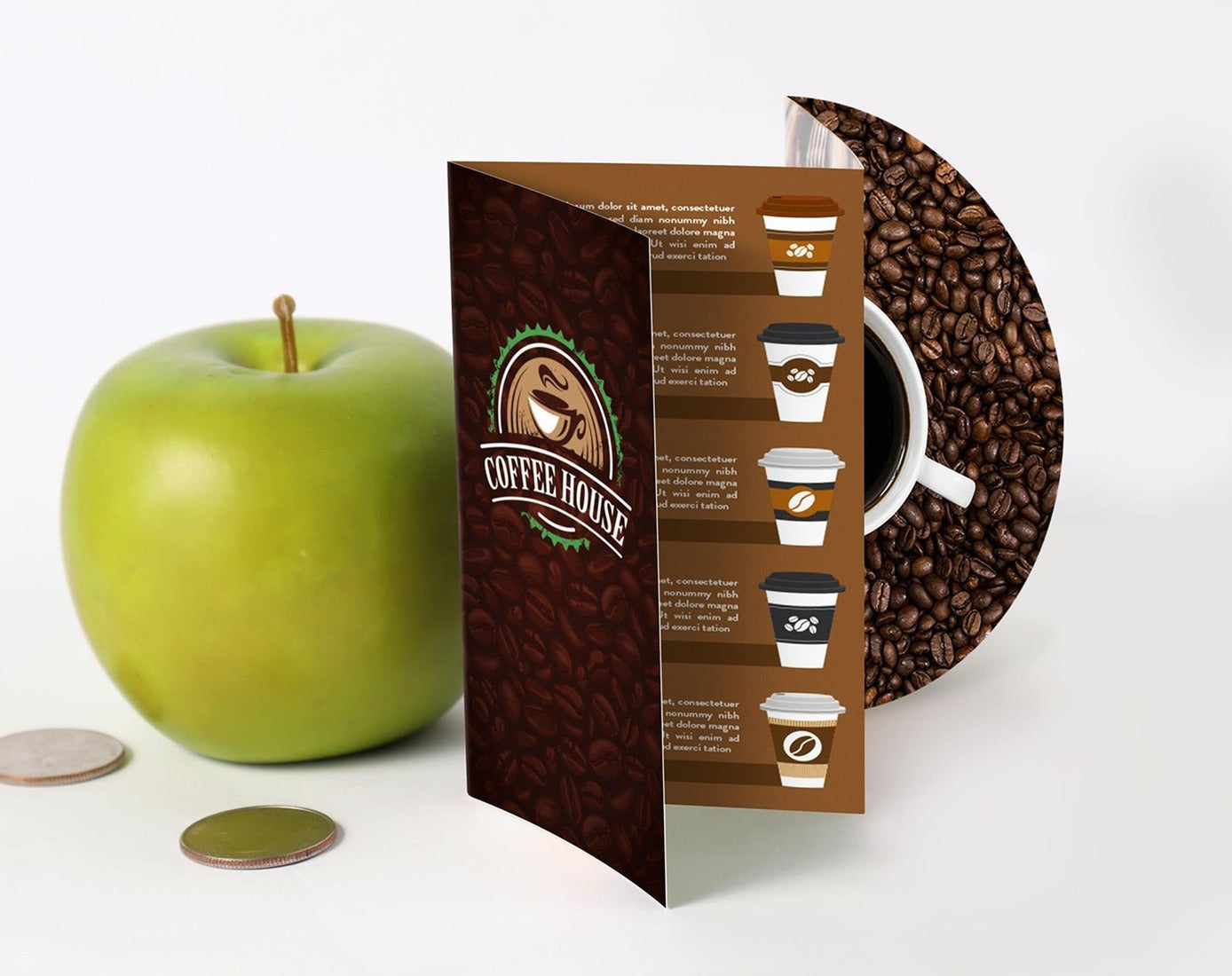
Bi-fold

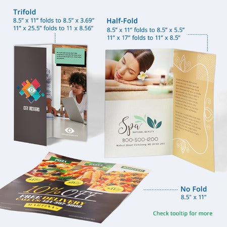
As its name indicates, this brochure contains two panels with enough space for lengthy text or large images.
3-Panel Folds
Three-panel folds work best for most brochures. Choose from the following three-panel folding options: the trifold or letter fold, the z-fold, and the gatefold. They have just enough space for all the important information about your product or business.
Trifold

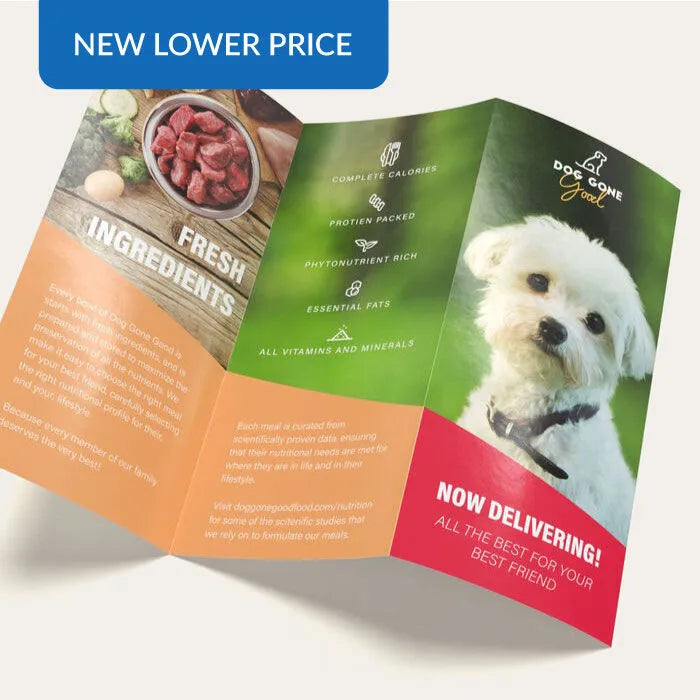
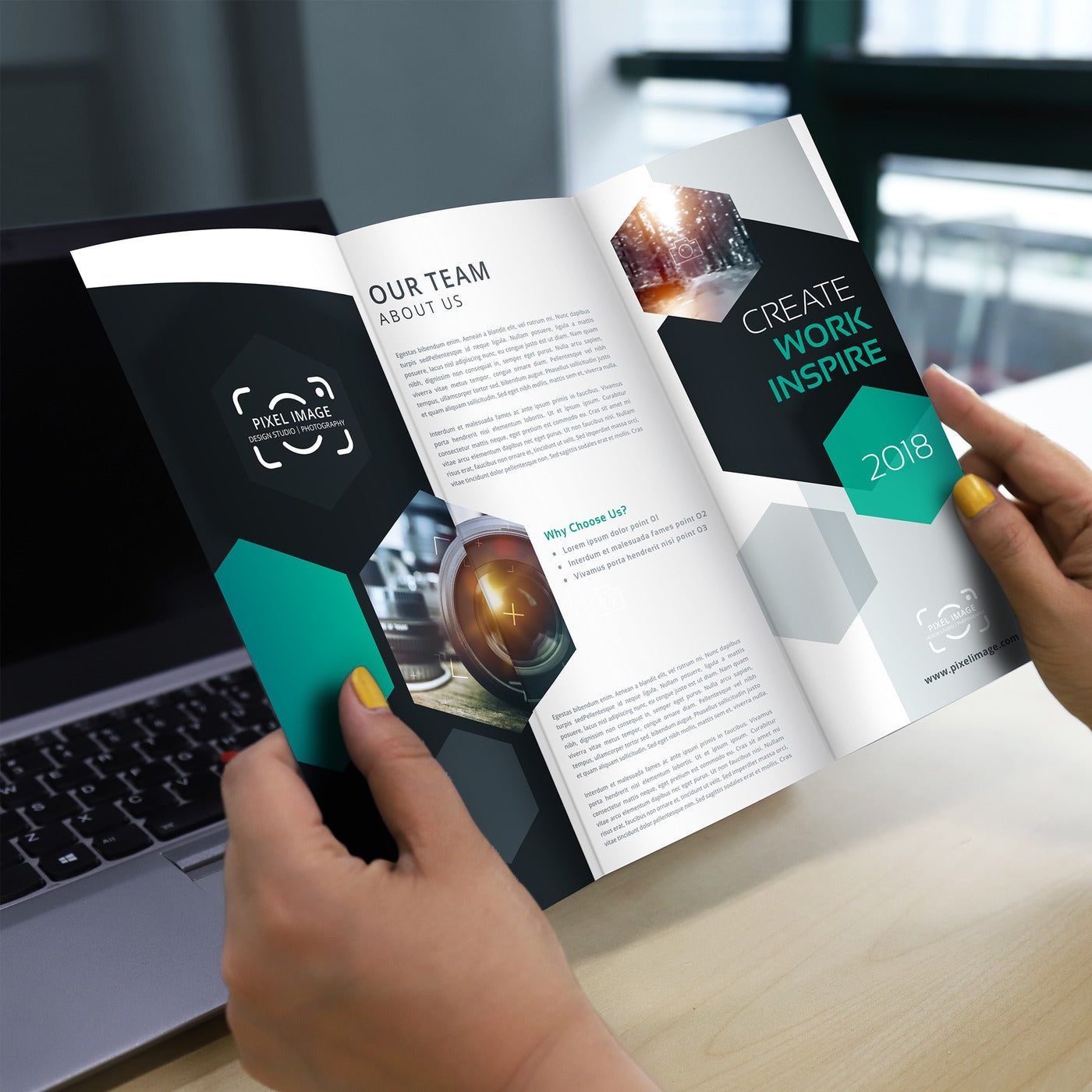
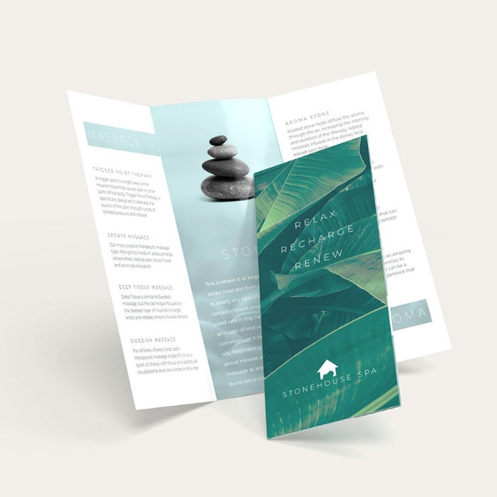
The trifold is folded twice to create three panels for a short, visual, and informative brochure. It is the most popular folding option.
Z-Fold

This commonly used brochure has six printed panels on both sides.
Gate Fold

The gatefold has two cover panels that open up to reveal a larger third panel.
4-Panel Folds
Four-panel folds are great for brochures that need to contain more information while still keeping them perfectly organized.
Accordion Fold
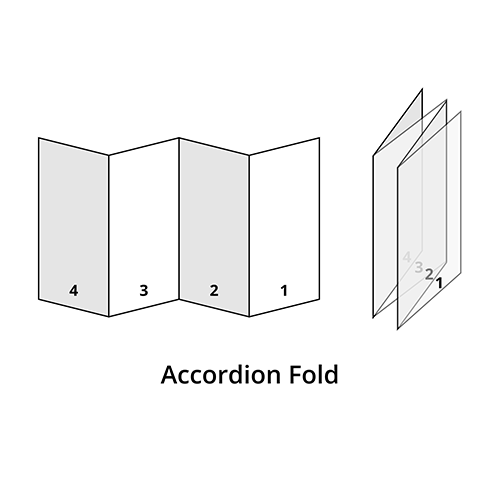
This brochure fold forms a zigzag pattern.
Double Gate Fold

This fold is similar to the gate fold, with an extra fold in the center. It is also known as a closed gatefold.
Double Parallel Fold

This fold is folded equally in half then folded again in the same direction.
French Fold

The French fold is folded in half horizontally and then vertically folded in half to create the four equally sized panels.
Roll Fold

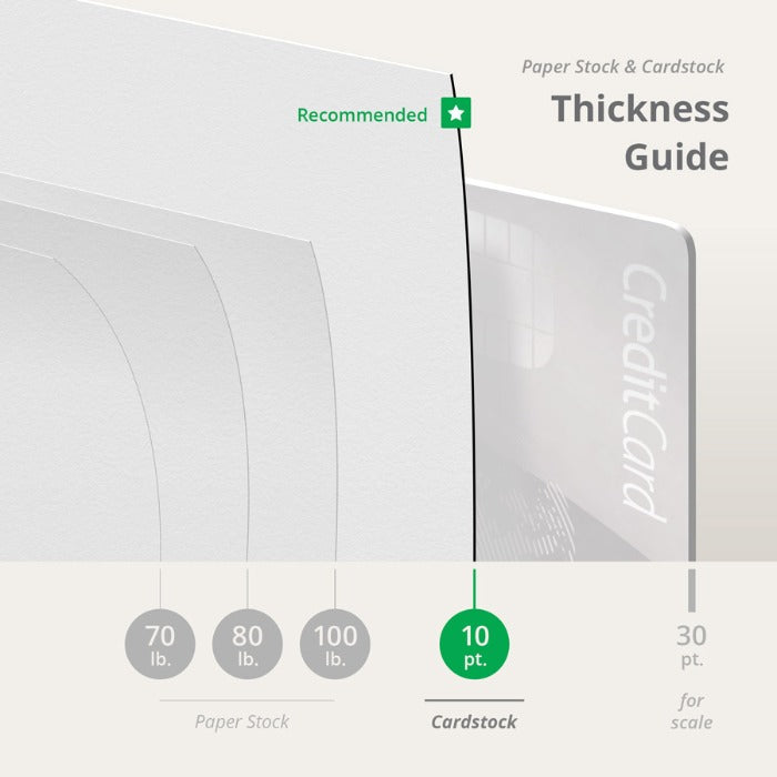
Roll fold is folded three times from right to left. Each panel is directed to fold toward the left. We print brochures for you on three premium paper coating options. Glossy paper is vibrant, while the matte’s smooth surface is elegantly subdued. All brochures are printed on paper stock and 10 pt. cardstock is folded before printing.
Brochure Sizes, Folds, and Sample Designs
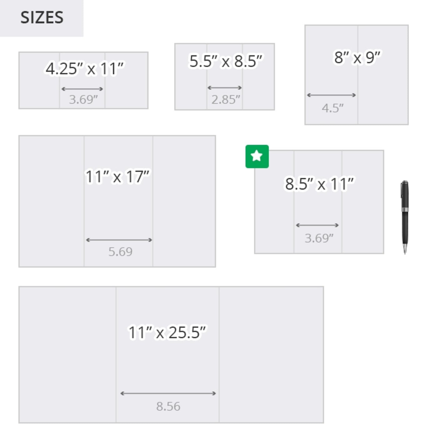
The information you will include determines the brochure size suited for your business. There are five standard brochure sizes — which you can combine with five popular types of paper folds. It helps to create an outline of your content to have an idea of the size that best works with your material.


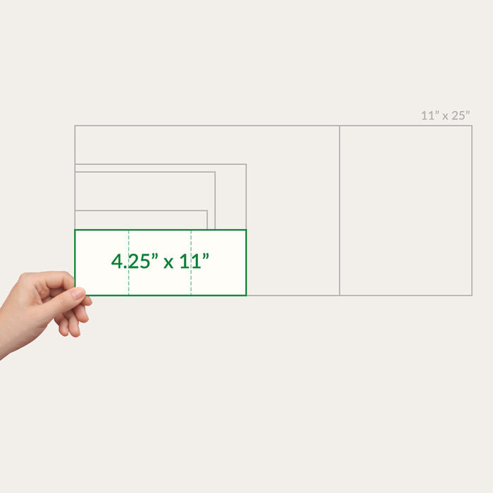
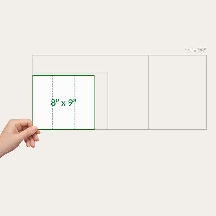
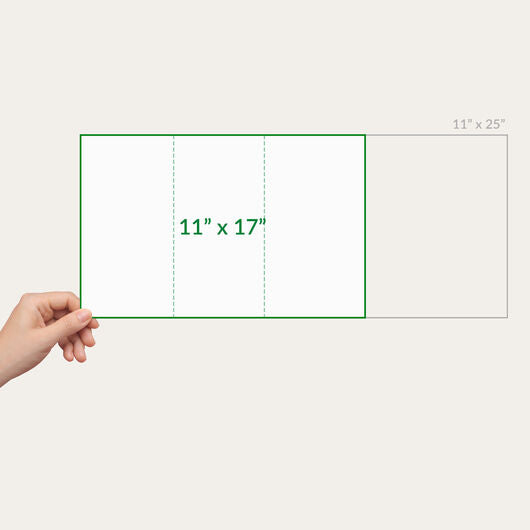
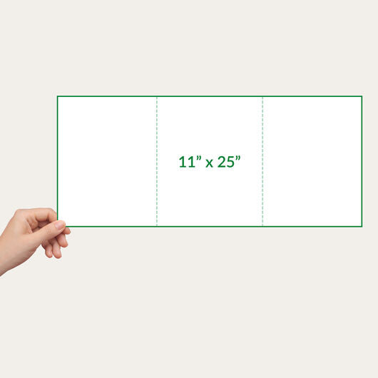
The final folded size of your brochure depends on the combination of: flat paper size, fold, and orientation (horizontal or vertical). We have blank brochure templates for standard brochures that you can download to guide you in creating a layout — or you can download the templates below.
Brochure Size for every business
Standard brochure sizes from 5.5" x 8.5" to 8.5" x 14" are used by businesses that wish to spread information about their products and services. Below are examples of industries and/or events where we can use these sizes:
- Services - A good example of this would be photography studios. These brochures can feature sample works, special packages, and contact numbers.
- Medical - informative guides that summarize health care facts, medical conditions, health concerns, and general first aid topics.
- Real Estate - Description of commercial and residential properties and property information such as the address, property specifications, and contact numbers
- Trade Fair - participating companies in these events have an opportunity to communicate with their audience through brochures. They can showcase and demonstrate their products and services and position their brand among competitors.
- Non-Profit Orgs - these organizations use brochures to explain advocacy, history, and mission to gain support from potential benefactors and the general public.
On the other hand, the larger brochure sizes, 11” x 17 and 11” x 25.375, are more appropriate if you want to have more detailed content because some businesses would require image-heavy content.
- Amusement/Theme Park Brochures - a definite need for theme parks to have because this informs people of featured attractions, rides, and other events.
- Mini maps - map representations are especially helpful for tourists to guide them throughout their trip. Ideally, mini-map brochures contain street names and popular landmarks. These are displayed on hotel counters and souvenir shops. A more detailed map may need custom sizing and options.

Tips on Text Layout
One challenge in designing brochures is creating the layout without crowding the copy and images. You should maximize space and position the design elements for a visually appealing design:

It helps to ask an opinion from a friend on your font legibility and overall design before printing it.
If you need sizes other than the standard options, UPrinting offers custom brochures up to 11” x 17” for digitally printed runs and 27” x 39” for offset jobs. All you have to do is to fit in your content, images included, and we will make sure your design is print-ready with our free proofing service. For more information on brochure printing, call us at 1-888-888-4211 or chat with our friendly representatives. Our lines are open 24 hours from Monday to Friday and from 8 am to 9 pm on weekends and holidays.
Fonts
- Choose easy-to-read fonts (i.e., Garamond, Helvetica, Times New Roman, or Century).
- Use a sans serif font, such as Arial, for captions or small type.
- Limit your font choices. Using more than two types of fonts will make your brochure messy, unprofessional, or playful.
- Use highlighting techniques – bold, italic and bigger font size — instead of varying font styles.
- Use a bigger text size for headlines and calls to action. Although not always, font size can be relevant to the importance of information.
- Choose font sizes that are proportionate to the size of your brochures. To help you decide on the font size, assess how many words you want to fill the space with.
- Use 12-point font for the body, 10-point font for captions, and 14- to 22-point font for headlines. These are recommended sizes, but your choices will depend on the overall look of your design.
Text Alignment
- Avoid putting borders on your paragraphs unless needed.
- Break long paragraphs into bullet points. Walls of text can discourage people from reading further, and bulleted information is easier to recall.
- Use proper typographic alignment (flush left, right, justified, and centered) for a neat layout.
- Align design elements — headers, images, and text —properly.
- Make spacing consistent throughout your design. Remember to leave white space on your layout to give your content a balanced look. This helps make your design easier to read.
Dream it, Design it
Dream it, Design it
Design Your Vision: Our talented designers work closely with you to bring your ideas to life. Collaborate with our creative team to create a perfect reflection of your brand.
Print it Right - 100%
Print it Right - 100%
Printing with Precision: Once the design is finalized, we employ cutting-edge printing techniques to ensure every detail is captured accurately. Our high-quality printing guarantees a professional finish.
Get it to Your Door
Get it to Your Door
Convenient Doorstep Delivery: Your order is efficiently prepared and arrives promptly at your doorstep. Sit back and enjoy the seamless delivery of your products. From projects big or small, expect the same dedicated attention to detail throughout.
Project Perfection
Project Perfection
Exceptional Project Excellence: With meticulous attention, we ensure every project meets your expectations. Our commitment to perfection guarantees your satisfaction, every time.
Get a Personalized Quote
Get a Personalized Quote
Get Your Customized Quotation: Our customer support team is ready to provide you with a personalized solution that meets your specific needs. Reach out to us today for a tailored quote on your next project.
